Yet another data visualization best practices post
A glimpse over effective data visualization conventions and a simple approach with examples over this ever ending topic.
April 2, 2024
Effective data visualization design and application is an ever-ending topic with numerous posts and resources written over the subject all the time.
Hence, I want to try and keep this post brief, since for any professional working in almost every possible Data role, they have most likely already encountered and read about these data visualization issues and aspects hunderds of times.
Common Issues in Data Visualization
However, considering the above, it is impressive how common it still is, to observe constantly in various dashboards and analyses pitfalls like, cluttered and overcomplicated visuals, weird and unintuitive graphs, and the list goes on.
This is a familiar problem, and the usual approach to tackle this in many organizations is, that they will reference you to either 10 different guides of “efficient data visualization” or recommend you to read books like the very classic “Storytelling with Data”.. ye not surprising I can imagine.
While I am not saying or even implying that all of these sources are bad, or that the aforementioned popular book is not worth it (I admit that I haven’t read it), all of them while being good, they are likely to overcomplicate the subject, therefore, suddenly you are faced with an abundance of information for a topic that should and is fairly straightforward.
Simplicity: Focus on Basic Graphs and Clarity
Let’s face it, the average Data professional that has to analyze some data and create a handful of reports and dashboards, does not need to create a funky shankey diagram or one of the many food named charts like waffle, lollipop, doughnuts charts etc. Those are usually more fit to help with your appetite than with your data viz goals. All somebody really needs for 90% + of their daily use cases is, a linegraph, a barchart and potentially a groupped or stacked barchart to accomodate for groups. That’s it, that should cover the visual aspect you use for almost anything, without having to think what would be the most groundbreaking way to present your data. While keeping always in mind, that these are also the graphs, that the receivers of your reports are most likely to be able to understand, without nodding their heads during a presentation while in reality they have no idea where to look to find the one piece of information or trend they are looking for.
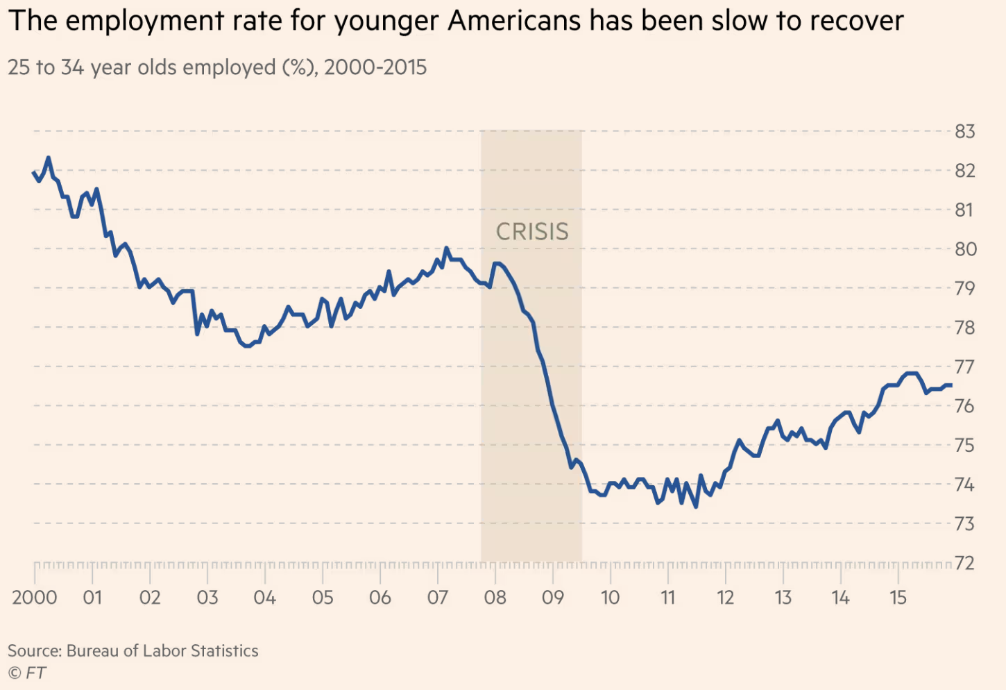
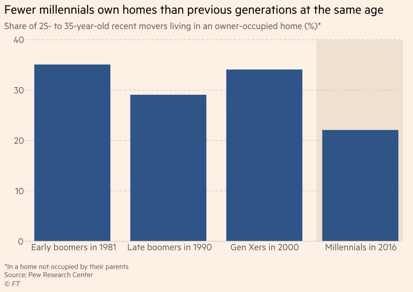
Now, while the utilization of only these ~3 graphs for almost all cases is enough, they still need to be kept tidy with a focus of maintaining a clean and insightful style. This is where the “visualization conventions” come in to play. My recommendation would be, that instead of circling over a numerous of different sources and books, to simply visit a website like the Financial Times (FT), which I will use as an example for this post, and subsequently follow them on LinkedIn or whatever medium you use (since also their website is paywalled), to drive inspiration, use as a reference point and ultimately understand how your visuals should always look like. The truth is that the teams responsible for data visualization in organizations like the Financial Times really understand and know how to effectively communicate data, since their audience is not just a couple of business stakeholders, but millions of readers with different backgrounds, and all of them should be able to retrieve the message from each chart. Thus, with such an approach, in reality you do not even need to have “experience” in visualizing data, simply visit a recent FT article and replicate their visual format and style to your own linegraph or barchart.
Creating the plots with Python and R
Hence, this what I will try also in this article. Creating a FT styled graph with Python using matplotlib and R using ggplot2, and show how easy it actually is to create insightful graphs. *Same approach would apply in any dashboarding tool, Tableau, Power BI, Looker etc. We will use self-defined dummy dataframe(s) just to facilitate our examples.
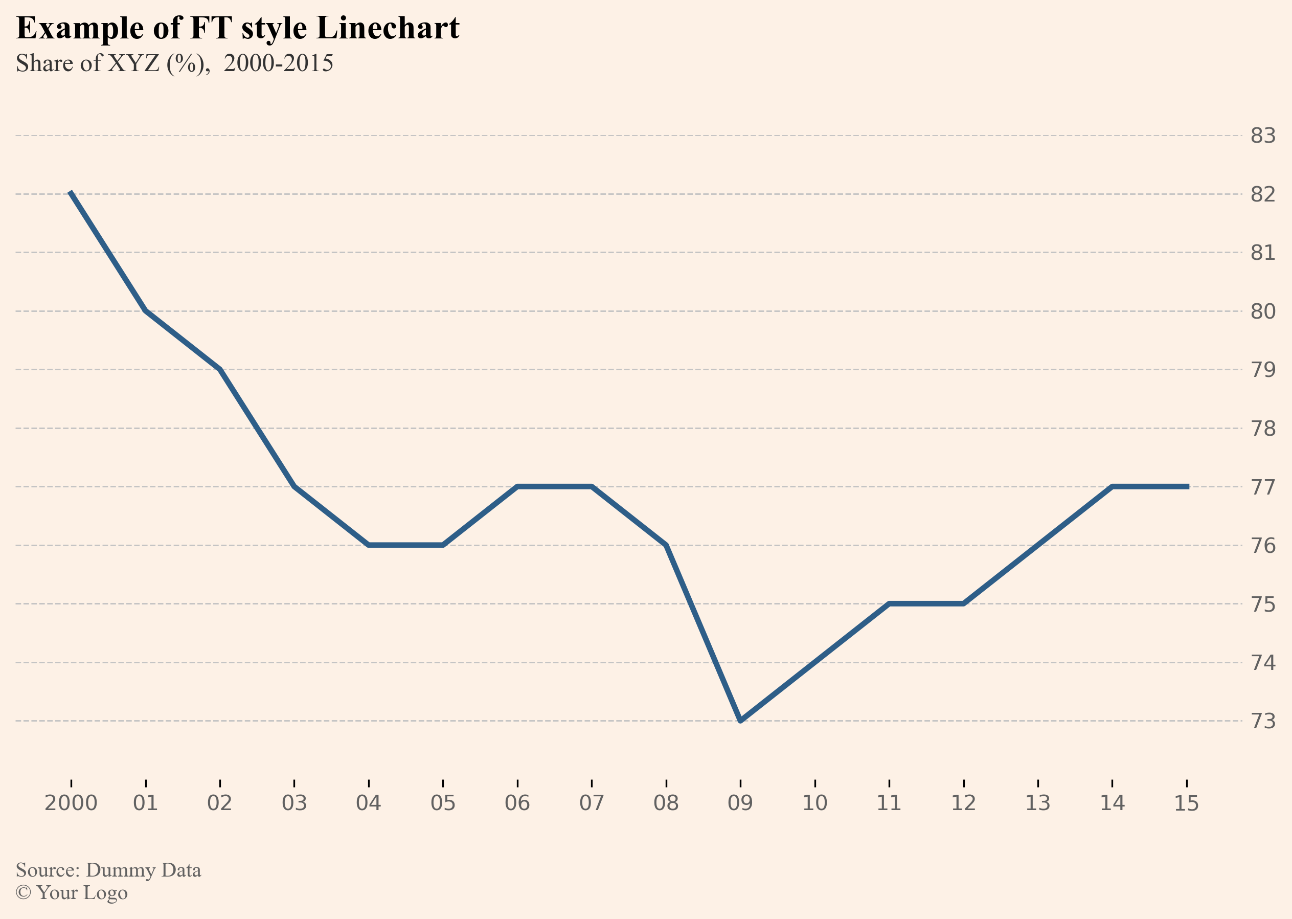
Let’s begin by first creating a linegraph using Python and the matplotlib package!
| |
The above code returns the following output for the linechart (line is rough estimation of example defined with the dummy data as we do not have the monthly values):
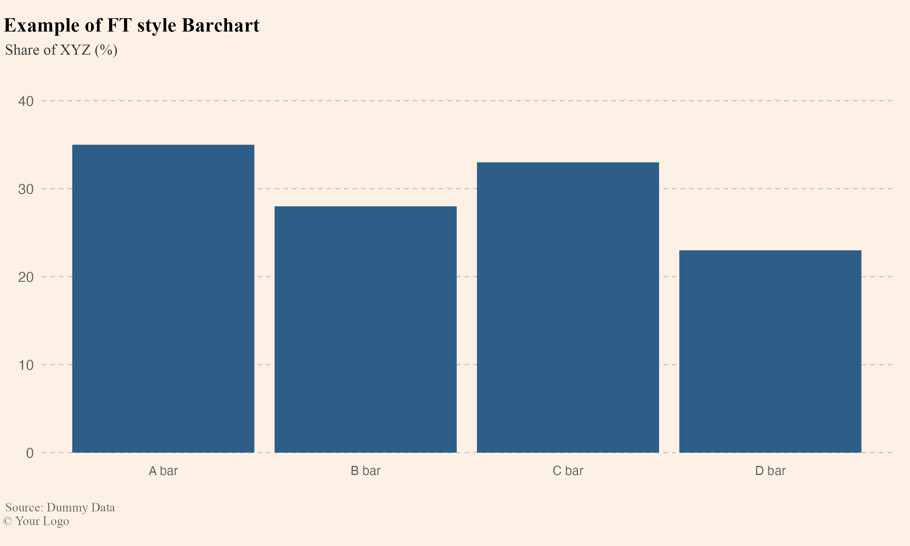
Now creating a barchart using R and ggplot2 as the library for data visualization!
| |
The above code returns the following result for the barchart:
Having these code chunks as baselines and saving the themes in some variables etc. you can always quickly recreate the graphs.
You can add additional elements like we saw in the example images like shades or annotations to highlight different parts of a graph to communicate extra information with the reader but always make sure not to overdo it!
In this post I showcased, the creation of FT based graphs that anyone can adapt to their own organisation font, palette and style to effectively communicate data through the foundational charts like the linechart and the barchart.
In essence what is highlighted is the importance of keeping visualizations simple, uncluttered and easy to understand. The main components of achieving this result is, using clear labels and scales, avoiding excessive colors, gridlines or other distracting elements and providing only the necessary context like time periods and units of measurement.
If you want to get an idea of how you can communicate your data using also other components like tables, then you can visit an older post of mine on this website, focusing on how to upgrade table data reports in an efficient and beautiful way, which you can find by clicking here!
For attribution, please cite this work as:
Yet another data visualization best practices post.
Michalis Zouvelos. April 2, 2024.
mzouvelos.github.io/blog/effective-data-visualization
Licence: creativecommons.org/licenses/by/4.0