Insightful table data reports using R or Python
A summary of examples on how you can level up your data reporting by leveraging table visualizations the right way and communicate key insights in a concise way.
June 2, 2022
Whether you are a data analyst, business analyst, or a data scientist, a big part of your work comprises digging through the ongoing streamlining of data and generating informational reports and presentations. Exploring and constructively presenting the most interesting data findings requires envisioning and summarizing the information effectively and efficiently.
One of the most widely used approaches to introducing data on time is using tables. A table can often be “boring” and challenging to read as a lot of the time confuses the reader and appears more like a plain excel file with a combination of numbers and text rather than an insightful visual that communicates the information successfully. Lastly, one of the most important factors to consider is that you need your reports to be automated and reproducible. Nobody wants to waste their time every day, every week, or month creating the same reports through obsolete manual technology tools. Not to say that these tools will most probably drive you crazy when your report gets ruined with a slight adjustment, and you have to fill in the new information every time yourself. Reproducible reports and presentations save a lot of time and can be highly flexible, good-looking, and intuitive.
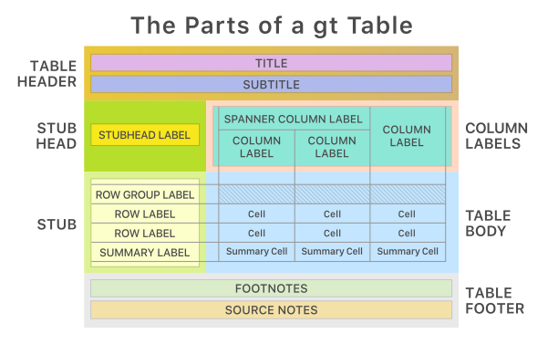
I will use the reasonably new gt package, which utilizes the R programming language to showcase how you can level up your reports. The gt package allows for some of the most impressive and informational tables. Its basic structure is demonstrated in the image below from the Rstudio’s official page. Update - package is now available also in Python great tables so you can achieve same results using Python utilizing same logic.
To demonstrate some of the package’s capabilities, I will be creating exemplary gt Tables. I will use two publicly available data sets consisting of data from Nike. The first data set contains information about Nike products from 2020, and the second holds data about Nike’s collaborating factories and locations.
Let’s start simple
After preparing and pre-processing your data, you have the data frame with the information you want to present and are ready to create your table. First, let’s create a simple table trying to present information about the top 10 Nike products by the number of reviews they have received. A first try would look something like this.
This table is at least underwhelming, but it is often what you will encounter in many data exploration analyses and even reports or presentations. However, the main problem isn’t that such tables are not just “nice-looking” but are tough to communicate and read. So let’s try and apply some steps and turn this plain table into a bit more exciting and valuable.
4 + 1 Best Practices to level up your table reports
1) Title and Source (the Mandatory)
First and foremost, your table should always include a Title, introducing the reader and the audience to what they are looking at, and a source note denoting where the presented information is derived from.
2) Add images (Immediate Context)
Adding relevant images is a perfect way to improve your table reports and give them more life. Let’s add the product images at this point. After you have stored your images in your data frame, you can print them in your gt table as an HTML element. Here, the data correspond to the URL link of the products.
3) Row sequence highlighter (Improve Readability)
The readability of the report is often overlooked by analysts who generate business reports, as it is more of a UX design attribute. Making your report effortless to the human eye will help your audience read your insights, especially for longer and more crowded reports. A very easily applied and fast trick is to introduce row sequencing highlighting.
4) Group text (Reduce Clutter)
Where possible, depending on how text-heavy your report is, it is best to try reducing clutter by combining the text. This is smoothly done in gt by creating a custom function with the glue package that ties your text with HTML and then calling gt to print out the new combined variable as an HTML element. Here we will combine the product name and product id to make the report more concise.
5) Formatting (Elevate your Report)
At this point, you have given your report a more transparent structure and context, and it has become easier to read and … look at. Now is when you need to play around and raise your report to the next level. Here you give attention to every detail of information to create a stunning reproducible table. The remaining steps include adding appropriate formatting and coloring to your report and implementing custom styles for your labels, text, and fonts. An extra tip is always to try and match the color palettes you will use with the brand name. After completing these steps, you will have created a report that communicates the insights directly to your audience but also drives them and assists them in spotting important patterns and absorbing the information faster. Let’s apply some of these steps to our table.
You can find the full code for the final table in my GitHub repo following this link: GitHub repo
You can see that the first plain and boring table has transformed into an insightful but further eye-pleasing report while remaining automated and reproducible. You can generate your gt reports from your code to html, pdf or png files easily by using the following code.
This is just the tip of the iceberg for the capabilities of the gt package since it offers countless possibilities. Here I name just a bunch of the things you can include:
- Sparklines and Trends
- Integrated plots and maps
- Aggregated and Summary Rows
- Application of Groupings
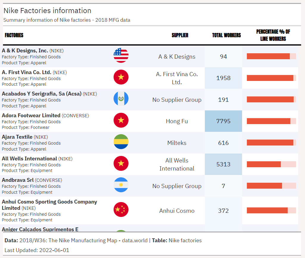
I will showcase one more example of a simple gt table generated with the Nike factory data. In this example, you can see how you can group your findings in the table by different conditions and integrate interesting functionalities like percentage bars.
You can find the full code for the factories table in my GitHub repo following this link: GitHub repo
If you needed to display a large amount of information, you could even create an endless scrolling page to preview all your information by generating an HTML print text. You could achieve that by separating the main body from the rest and having discrete HTML elements that you would then merge into a whole HTML element. You can find an example of this approach on this youtube video by one of the package’s developers. Below, I am providing a gif of this solution to show you how that would look since this is an HTML element and thus need to be hosted. In this report, all the factories included in the data set are showcased in the scrolling table, hence capturing all the information.
You can find the full code for the scrolling factories html print in my GitHub repo following this link: GitHub repo
You can find additional examples of gt tables in the RStudio table gallery page where many interesting applications are displayed to gain inspiration.
If you need something more dynamic for your tables and reports, I encourage you to check the reactable table package. Suppose you need to display more graphs and visuals in a static HTML report. In that case, the flexdashboard package is an excellent tool that can also be transformed into an interactive dashboard using Shiny.
For attribution, please cite this work as:
Insightful table data reports using R or Python.
Michalis Zouvelos. June 2, 2022.
mzouvelos.github.io/blog/insightful-table-data-reports
Licence: creativecommons.org/licenses/by/4.0