Showcasing biodiversity through an interactive Shiny Dashboard app
Utilizing Spark cluster to load the biodiversity database of GBIF and using web scrapping to directly import the animal pictures with javascript. Wrapped in a Shiny Dashboard template.
June 10, 2022
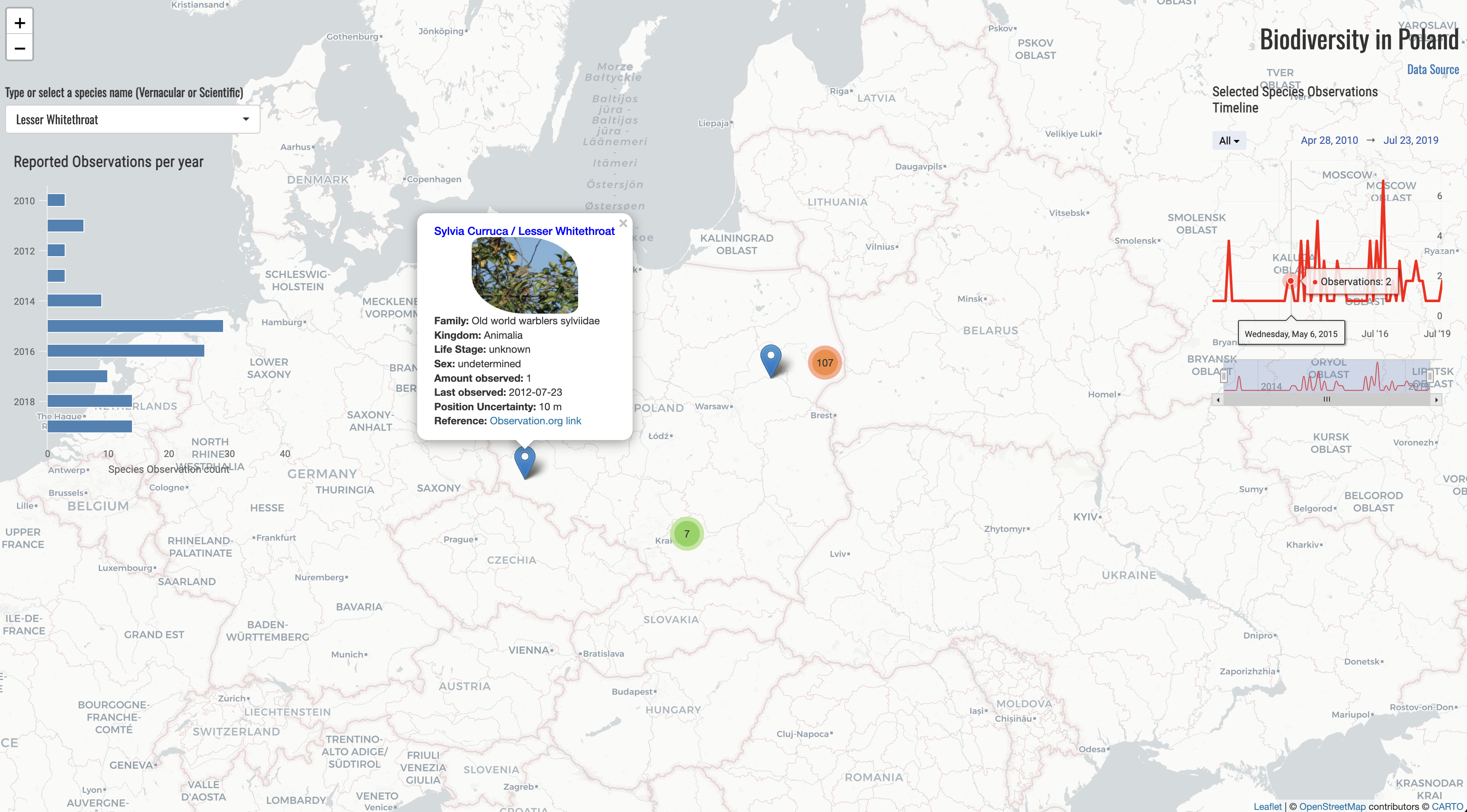
The Biodiversity Dashboard is a Shiny Application that utilizes data from the GBIF organization to provide an interactive exploration tool for the biodiversity of any area, showcasing Poland as an example for this dashboard. Hosted at the following shinyapps link which you can visit to explore the dashboard yourself, the application offers users the ability to search for species by their scientific or vernacular names and discover detailed observations on a map, including species information and their photo, a timeline graph of observations and a bar chart detailing yearly observations.
How It Works
The dashboard allows users to select a species and displays observations on a map, a bar chart with total yearly observations, and a timeline graph for daily observations. Each observation on the map comes with a popup label window, providing detailed information about the observation. This interactive feature is achieved through R cose with the use of R packages like leaflet for mapping layout, rvest for web scraping, sparklyr for a Spark connection and highcharter for the interactive graphs.
Shiny supports both Python and R code to easily create beautiful, informative and functional applications and dashboards. You can check more information about Shiny here on the links for Python Shiny and R Shiny.
Data Processing and Visualization
One of the project’s workarounds is the integration of a Spark cluster database connection for data loading. Due to the high volume nature of the global biodiversity dataset, Spark clusters facilitated efficient data handling, extracting relevant observations for Poland into a manageable csv file. This approach underscores the importance of scalable data processing techniques in handling large datasets in a quick and efficient manner with no high complexity required.
After loading the database with Spark (using the sparklyr library) then you can process the data and write the subset of data you need from the database to use in the app.
| |
Moreover, the project employs the rvest package for web scraping, gathering images from observation reports to enrich the dashboard’s informational content. This integration of images directly into the popup labels on the map enhances user interaction, providing a more immersive experience.
Just by reading the whole html page and setting the xpath of the html node by using any dev tool addin you are able to scrape the data.
| |
Interactive Elements and User Experience
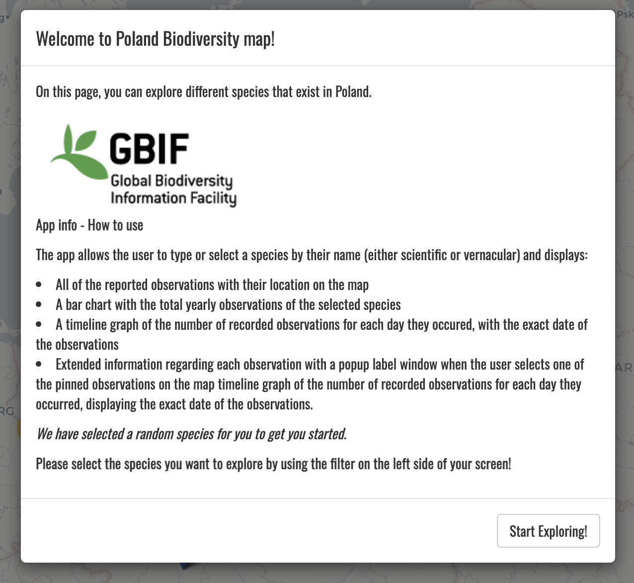
A pivotal aspect of the dashboard is its focus on user interaction and engagement. The implementation of highchart interactive charts adds a dynamic layer to the data presentation, allowing users to visually explore the data in depth. Furthermore, the app initiates with a welcoming pop-up message, guiding users on navigating the dashboard and making the most out of their exploration.
You can integrate a pop-up message in your Shiny app easily by defining the modal and providing html tags
| |
Then the popup looks already clean as follows:
The decision to host the app on shinyapps.io is an easy and free solution to showcase an app. shinyapps.io offers a platform where projects, can be shared widely without the need for users to run complex setups locally. Of course the free version comes with limitations but it is still a niche solution to showcase some simple projects like the one displayed on this blogpost.
Wrapping up
The development of a simple niche application with few lines of code is always an enjoyable and creative way to use some common Data Science practices like data processing with database connectors like Spark, employing web scraping and utilizing different libraries to provide a beautiful and seamless front-end for informative exploration. You can view the whole code used for the project in my GitHub page following this link and visit the app by clicking here or directly on the image below.
Image preview of the app:
If you are interested to dive in into more dashboarding with shiny for Python or R there are many more examples, simple and more complex. You can find some in the official galleries R shiny gallery link and Python shiny gallery link.
For attribution, please cite this work as:
Showcasing biodiversity through an interactive Shiny Dashboard app.
Michalis Zouvelos. June 10, 2022.
mzouvelos.github.io/blog/shiny-dashboards
Licence: creativecommons.org/licenses/by/4.0